Tag Archives: MS Word

Famous Last Word Post

We’re here! Which is to say, we’re done with Microsoft Word, and we can now start doing stuff directly related to making E-books for EPUB and Kindle.

If you’re an old pro text editor who skipped the first four tutorials because they were too Word-y, welcome back! I’ll ask your indulgence for just one more paragraph:

Word people, now that you’ve used Microsoft Word’s Styles to define all parts of your document, now that you’ve proofread it, now that you’ve sent drafts out to your contributing poets for their input, all you need to do to join us in Web world is save your Word document as .html. Go to the File menu, select Save As, and then select “Format: Web Page (.htm)” and select “Save only display information into HTML.” Give your file a name without spaces, such as “YBR_MSWord_Style_Formatted.htm.”

Image

That’s it! Done with Microsoft Word. Now you’ve got ONE .htm file. Continue reading

1 Comment

Filed under Look and Feel, Manuscript Preparation

First Substance, then Style

Once you have a plain text file, dress it up with MS Word Styles. Just be careful not to fall in love.

Again, that screaming sound you hear is from well-intentioned people (well-informed, even) who simply cannot abide the thought of using MS Word for any part of making a poetry E-book anthology. If you are comfortable in CSS/HTML, then you can ignore this post, and catch up with us once we get into the posts about line and stanza classes.

But if you’re squeamish about CSS/HTML and comfortable in MS Word, then perhaps this step will serve as a gentle introduction to the concept of logical, hierarchical page structure. Many other sites cover MS Word Styles in depth. The main idea, here and later on, is simple: Don’t make text look fancy. Define it as fancy. Continue reading

7 Comments

Filed under Manuscript Preparation

Indented Indentured Servitude

Poets have their own styles. But a poetry anthology should set some formatting ground rules.

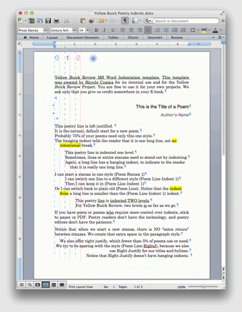
For Bicycle Comics’ poetry anthologies, we allow three levels of indent, plus centered and right-justified text. That’s five different relations a line of poetry can have with its margins.

indents on screen

  1. flush left or “normal.” This is level “0” above, for 0 indents
  2. 1 indent, still left justified with a hanging indent
  3. 2 indents, still left justified with a hanging indent
  4. centered text, indents not applicable
  5. flush right or right-justified text, indents not applicable

I think that’s enough. Limitations help creativity, they don’t hurt it. Few people complain anymore about Twitter’s 140 character limit, or SMS’s 160 character limit. Not that many people complain about sonnets with only 140 syllables, or pianos with 88 keys.

If a poet is really fussy about margins and indents, then chances are a digital anthology isn’t the right choice for that poet, anyway. With E-book poetry, you can only recommend the final appearance of a poem; you can’t control it.


5 Comments

Filed under Book vs. Ebook, Manuscript Preparation

Cleaning Your Manuscript: Think of Steamed Rice

Long before you dive into InDesign, Dreamweaver, or an HTML tool, you want a clean text file.

Really, you do. In fact, you can even forgo Microsoft Word for the first part of this step, if you like. Strip out things such as tabs, funky fonts, charts, and clip art (ew). Make your manuscript painfully simple, and you’ll reap many rewards further on. Look how boring the original MS Word document is for Yellow Buick Review:

MS Word plain

Fear not; the E-book will be much prettier.

We call this the “steamed rice” version. It’s plain, it’s readily digestible, it’s unlikely to cause problems. Terribly bland, though, right? That’s fine. Steamed rice provides the foundation for all the spicy, yummy stuff you’ll be cooking up. Best learn this point early: Don’t bother making your poems beautiful in MS Word. You’ll make them look beautiful later, after you’ve made them look clean.

What does clean mean? For our anthologies, it means:

  1. A “big” font in a universal typeface. Think 16pt Times New Roman or 14pt Helvetica. If there’s an extra space or a missing period, you’ll want to notice it.
  2. Smart quotes, as in “sixes and nines.”
  3. Real dashes, as in “—” or option-shift-hyphen on a Macintosh.
  4. No soft returns. A soft return is a shift-return. Poets use them all the time for enjambed lines, but they are poison to poetry E-books.
    Here is a soft return. Find them. Delete them.
  5. One space after periods. Typewriters are long gone, my friend.
  6. Elipses … instead of …  (Can’t tell the difference? Try highlighting them with your mouse.)
  7. No tabs, no spaces. You’ll make indents later, with styles.
  8. Absolutely no handwriting, illustrations, or funky fonts. Fractions and footnotes should look boring: 1/4, 3rd prize, etc. You can use âçcént marks and basic symbols such as £ or π, but beware anything outré. A good rule? “If you have to look up how to type it, don’t bother.”
  9. (Optional) Italics and boldfaced words. I’m really torn on this one. If it were truly up to me, I would avoid them in MS Word, and add them at the very end with character styles. However, this stage is often where we do the most E-mail proofreads and edits with our contributing poets, and many of them must see their emphasized words.

Continue reading

1 Comment

Filed under Book vs. Ebook, Manuscript Preparation

The Poetry Workflow Flowchart

Everything Bicycle Comics has learned about formatting poetry anthologies for Kindle and Kobo.

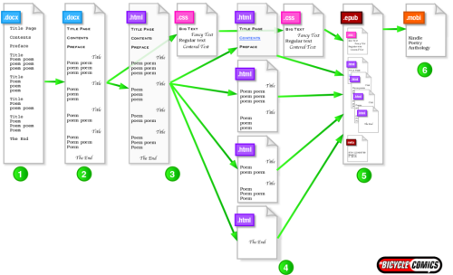
workflow illustration

From MS Word to Kindle in six steps!

There it is. Depending on where you are in your publishing journey, that workflow looks beautifully simple or laughably Byzantine. Don’t worry; I’ll walk you through each of these steps in future blog posts. But big-picture, here is how we move an anthology from manuscript into Kindle and Kobo.

  1. Paste and proofread all the poems as plain text. We remove nearly all formatting from the poems. The document should look like (or actually be) a text file. Here we can check spelling and discuss proofreading/editorial changes with poets via E-mail. The entire interior of the book is in one whopping-huge Word document.
  2. Lightly format the book in Microsoft Word. We add basic structure to the book. If it can’t be done via the Style menu, then we probably won’t do it. We try to have all of our content debates now, because after this step, our book “forks” into two paths: one set of files goes to InDesign for our paperback edition, and one set of files goes to Dreamweaver for our E-book. If we make a change now, we make it one time. If we make a change later, we’ll need to make it twice.
  3. Save the document as HTML + CSS. We tell MS Word to export our document as HTML, and then we use Adobe Dreamweaver to tidy up the resulting code. We also pull all styling of the document into an external style sheet. If you’re coming from a traditional publishing background (QuarkXPress, InDesign, PageMaker), this step will seem the most foreign and tedious. I’ll talk you through it!
  4. Separate the HTML into chapters. We split our one huge interior HTML file into several smaller HTML files. For the most part, we split at chapters; each month of our Tandem anthologies is one chapter. Our table of contents, foreword, and contributor biographies become additional “chapters.” For the most part, we try to have all our chapters use the same, external cascading style sheet, but we’re open to adding one or two mini .css files if we really need them.
  5. Place the HTML and CSS files into an EPUB. We’ve been using Sigil, a free, open-source EPUB editor. Sigil wrangles together our HTML/CSS files, plus any images or media files we’ll be using. Sigil also helps us make a Table of Contents. Once we’re happy with our Sigil EPUB, we’re ready to publish on Kobo, Nook, and Google Play Books!
  6. Create a MOBI and/or KF8 book with Amazon Kindle Previewer. We use the free Kindle Previewer program to translate our EPUB into Amazon’s specialized Kindle format(s).

On a tight budget? Bicycle Comics uses both commercial and free software to make our poetry E-books. In subsequent posts, I’ll offer advice on how to work through each step using low-cost substitutes for some of the expensive programs.

2 Comments

Filed under Look and Feel, Manuscript Preparation, Organization and Data

A Word About…Word.

Microsoft Word wasn’t made for E-books. But we have to start there anyway.

My college poetry teacher was adamant on this point: Never apologize for something you are about to do. Either don’t do it, or don’t apologize. Well, I’m sorry, but…I’ve created this whole tutorial workflow using Microsoft Word as the starting point. Hear that noise? That low, distant howl? That’s an Internet full of E-book editors who believe MS Word has no place in E-book production. (Some of them aren’t wild about the hyphen in E-book, either.)

Microsoft Word log

The big blue elephant in the room.

I actually agree with them. I think MS Word is a fine writing tool. Great for school papers, business memos, and publishing contracts. Books and E-books? Not so much. Word creates needlessly bulky .xhtml files. It gives InDesign fits. If I had to make a Bicycle Comics book in just Microsoft Word, I’d howl, too.

It would be simpler, and cheaper, to use a basic text editor such as TextEdit for Macintosh. And OpenOffice added an EPUB tool recently…

But I’m picking my battles, here. MS Word may not be an ideal E-book tool, but it’s nearly universal. You may not have the Adobe Creative Suite, but you probably have Word. Chances are, you used it to write and revise your poems. So we’ll start there.

If you have intermediate or advanced coding skills for HTML/CSS, or if you simply can’t abide a detour through MS Word, fear not! We’re only using Word to get to an HTML/CSS baseline, anyway. Catch up with us after we’ve finished Step 2 and ride the rest of the way through xHTML, external CSS, .ncx and .toc files, indexing, and so forth. We’ll put a link right here when we get that far.

4 Comments

Filed under Humor & Inspiration, Manuscript Preparation